All projects end, but it’s easy to lose sight of the finish line when you’re deep in the work. You need a high-level view to appreciate the process. That’s why project managers and Agile teams use tracking tools to visualize progress and circumvent setbacks.
There’s no one-size-fits-all project planning and monitoring document, so you’ll typically use a group of tools to cover every need. And burndown charts are often among those resources.
Burndown charts help teams visualize the road ahead and plot their progress against initial time and resource expectations. Groups that use burndowns plan more accurately and set better deadlines, in turn increases the chance they’ll meet client and employer expectations.
What’s a burndown chart?
A burndown chart plots progress versus time to help pace teams, allowing them to monitor the original sprint or project timeline against completed work. These charts predict whether teams will finish work on time, letting you monitor workflows or resources and manage client expectations before a project is too far off course.
Teams can use sprint burndowns for iterative processes or entire projects. In both situations, team members update the chart as they make progress. But they don’t shift original projections, even if they’re ahead or behind schedule, so your team understands initial forecasts.
What does a burndown chart include?
Burndown charts comprise X (vertical) and Y (horizontal) axes. The vertical axis displays story points, which are numbers that estimate the impact of the work. The horizontal axis represents time — or whatever the chart covers, from a sprint to entire projects. Teams typically track time in days, but some may use hours or other periods that suit the work.
This graph displays two lines. The first is the ideal work remaining line, which runs diagonally from the total number of story points on the top of the vertical axis to the last day of the project at the end of the horizontal axis. This line may be a straight shot on some graphs, but others show an undulating or fluctuating line to represent faster and slower parts of the project.
The other line on a burndown chart represents the actual work remaining. Teams update the data points and plot as they work, and it’s normal for this line to trace over and under the ideal work line as tasks take different amounts of time than initially projected.
Burndown versus burn-up charts
Both burndown and burn-up charts track progress, but they do so in different ways.
Burn-up charts track story points versus sprints, similar to a burndown chart’s method of tracking story points versus days. But burn-up charts track the total work against completed work instead of monitoring how much time the project has left. Teams can also edit project scope on burn-ups and, in turn, the total work line on these charts. On burndown charts no one changes original projections, because a central point of these charts is to keep initial forecasts in mind.
Burn-up and burndown charts complement one another nicely, with burn-ups reflecting accomplishments and burndowns signaling how far a team is from finishing a project and whether they’ll do so on time.
The pros and cons of burndown charts
Burndown charts are just one helpful project management method, and they don’t have to fulfill every need. Here’s how these charts shine and where they’re less valuable than other planning tools.
Pros
Burndown charts are:
Excellent at tracking time — they show teams how close to original project length projections they are.
Good for sprint planning — if teams aren’t completing story points as quickly as expected, a project manager may infer they’re taking on too much.
Helpful for keeping employees in the know — like any shared, updatable project management tool, burndown charts help everyone visualize progress in real-time.
Cons
Burndown charts are:
High level — they won’t provide nuanced information on why a project is slowing down or represent task priorities.
Inflexible — teams can’t make changes if a project’s scope shifts, and the chart only shows if the team is ahead or behind the original and ideal projection of work.
How to create a burndown chart: 4 steps
You can make a burnout graph with your team during the project planning phase to better understand your timeline. Follow these four steps to create a well-defined chart.
1. Project the time and effort of the work
Make a to-do list by considering the backlog of work and invite team members to estimate how much they can complete for the project or sprint. Use story points to determine the intensity of the work (you might use a Fibonacci sequence, meaning each number is a sum of the two before it (i.e., 1, 1, 2, 3, 5, 8)) to help you make more accurate projections for how much the team can achieve. Then determine how long this work will take.
2. Enter your ideal progress data points
Plug your ideal story points and timing into an Excel spreadsheet or project management software like Notion. Create one column for the project dates, another for the ideal burndown (diminishing story points), and a final column for the actual burndown, which you’ll update throughout the project.
3. Plot the chart
Use your chosen software to graph your data points. Remember that your chart will only show the ideal work line until you begin the project.
Keep this plotted chart someplace central, like a team workspace, so everyone can access and adjust it as the project progresses.
4. Add actual work data points
Plot completed story-point data on your chart. If you projected the team would complete 20 story points in two days and it finished 25 instead, the actual burndown line would hover over the original projection.
Scrum and Agile burndown charts
Agile and its subset process framework Scrum both promote iterative pieces of work, often called sprints. And burndown charts are excellent for tracking progress on iterative processes, so much so that some call these graphs Scrum charts. But what’s the purpose of a sprint burndown chart?
Teams can use burndown charts in Agile sprints (bite-sized goals) and epics (larger goals) to plan better future iterations, leaning on data from previous ones. They can understand why a project ran more slowly than expected by performing a gap analysis that breaks down the “Why?” behind discrepancies.
Project managers can also use burndown charts to plan resources at the start of a sprint and reassign tasks if they notice their team is deviating from original projections.
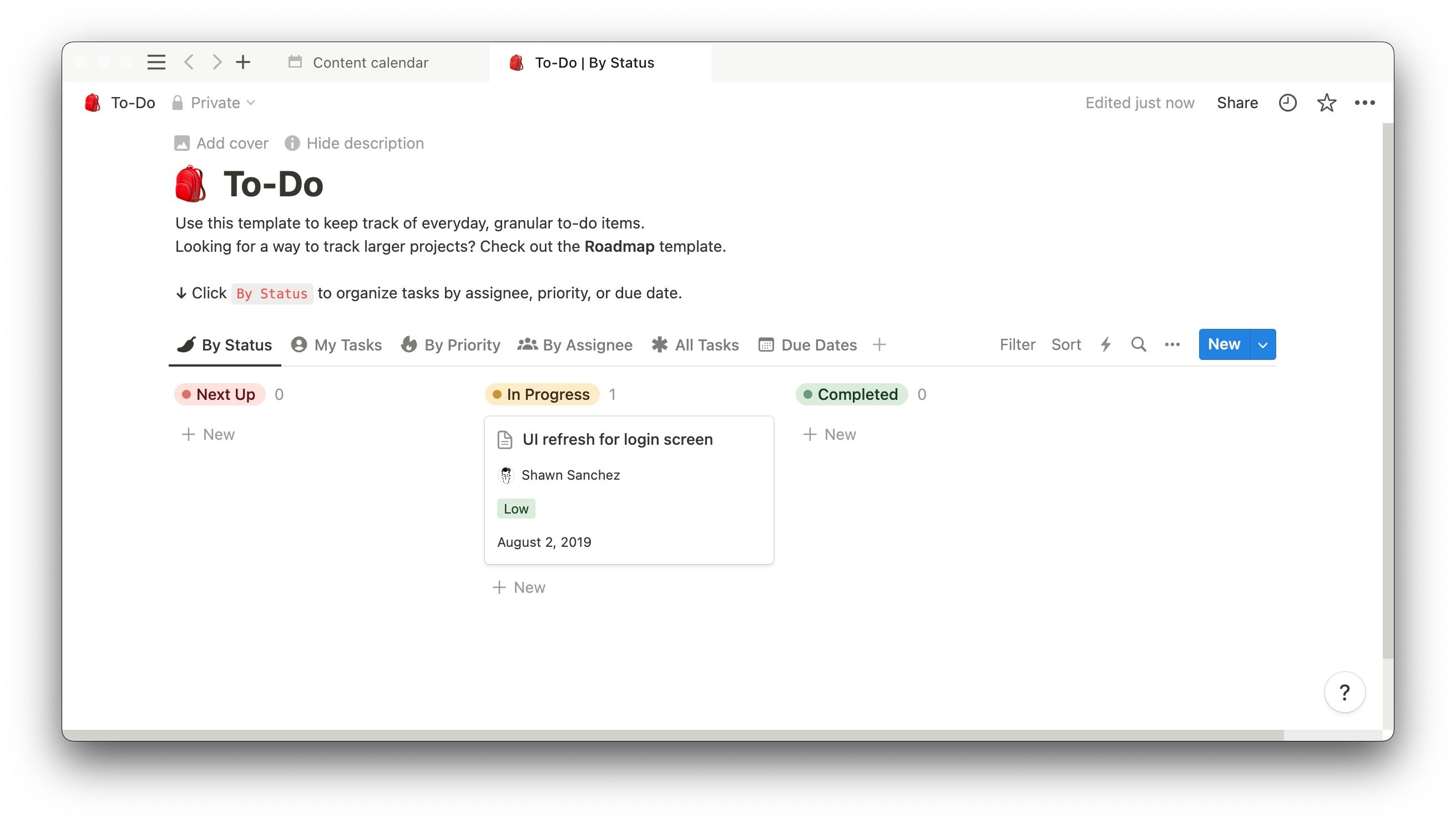
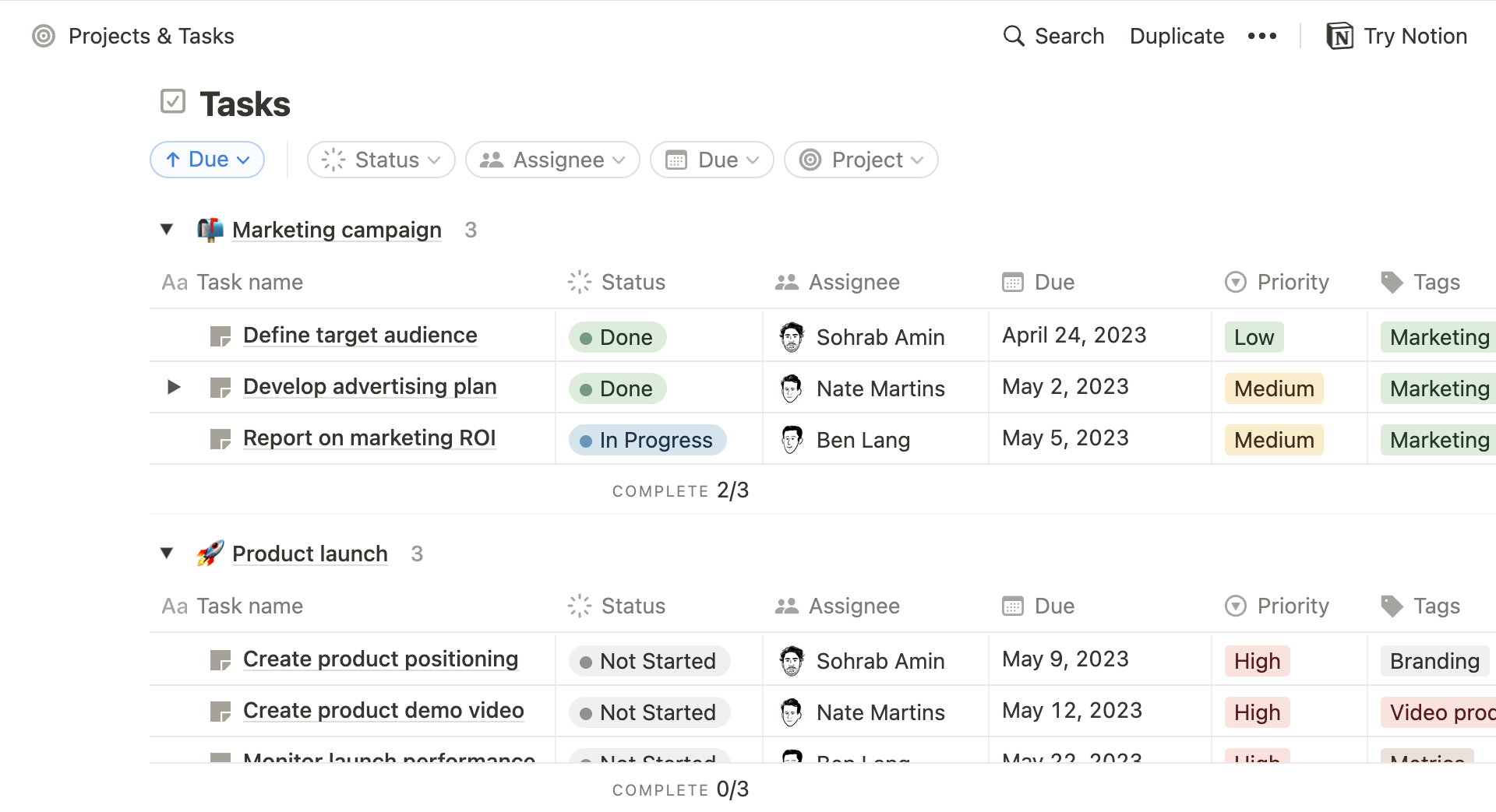
Notion makes project management easier
We understand that project planning is a project in itself. That’s why we’ve created templates and tools to streamline teamwork.
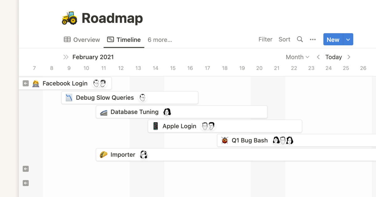
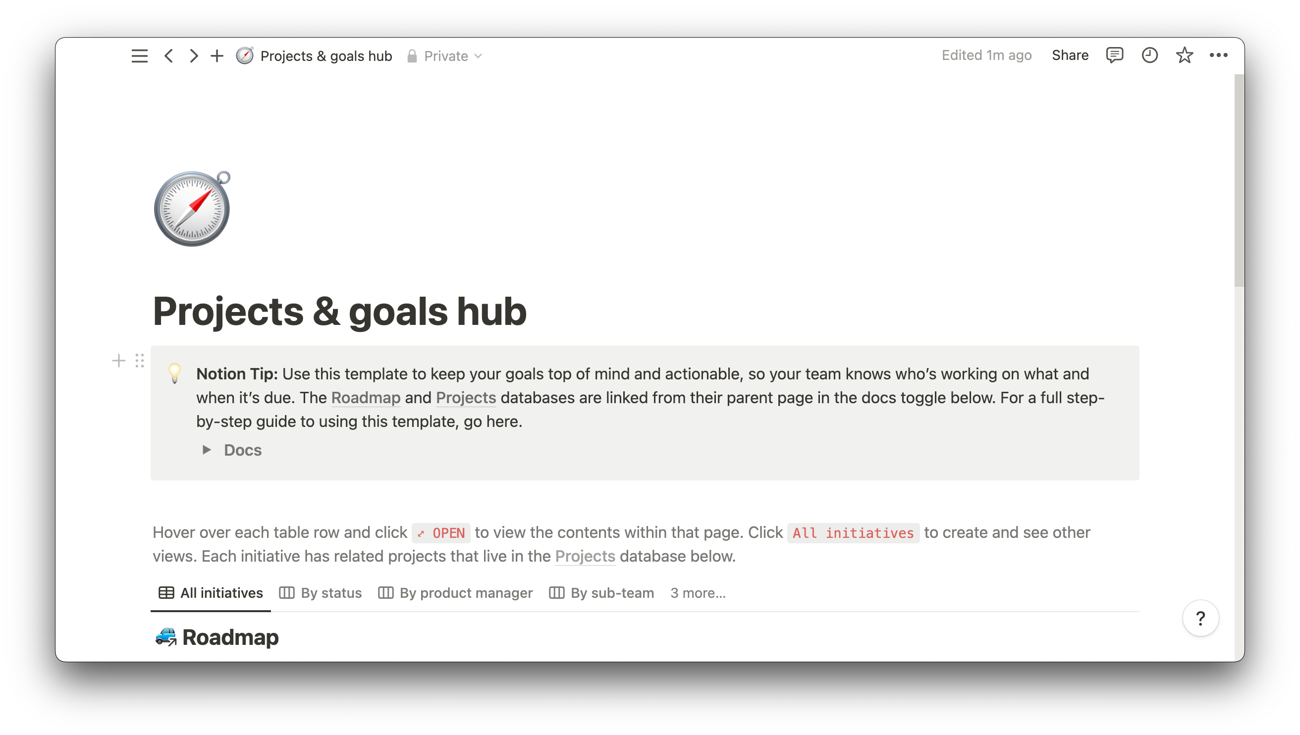
Use the road-mapping template to plan the route forward, the project goals hub to visualize objectives, and the task tracker to keep multiple projects running well. Or search our template gallery to find something perfectly suited to your needs.