As a project manager, you’ll rarely encounter a project with only a single task. Completing deliverables just isn’t that simple.
Resources, dependencies, responsibilities — you need to chart all these things, and then some, to ensure your project’s viability and offer your team expectation visibility.
This is where program evaluation and review technique (PERT) charts shine. These flowcharts mark the journey your team will take to deliver something exceptional without delays or roadblocks.
What’s a PERT chart?
First used by the U.S. Navy's Special Projects Office in 1950 to wrap a timeline around the Polaris nuclear submarine project, a PERT chart is a handy project management tool that clearly outlines tasks, dependencies, and time frames with shapes and arrows. Project managers use this chart to visually represent a project. This helps them hone in on individual tasks or dependencies to schedule tasks appropriately.
At a minimum, these charts show project managers the least amount of time their team needs to complete tasks within a project. Managers can also review this step-by-step visual aid to estimate risk factors and track progress.
From a visual project management perspective, PERT is similar to the critical path method (CPM), and you can create both charts with the same shapes and lines in programs like PowerPoint or Lucidchart. But the CPM highlights vital tasks necessary for completing a project, while a PERT chart in project management outlines all tasks, dependencies, and deadlines.
How does a PERT chart work?
A PERT chart works by expanding the CPM to every task and dependency and their relationships. If you must finish item one before item two, an arrow on your PERT chart indicates that.
Outline a PERT chart as part of your project roadmap planning and use this simple outline to gain timeline sign-offs from management, communicate objectives to stakeholders, and as a visual tool for mapping out all task interdependencies. And, of course, your PERT chart offers a time estimate for project completion to help you avoid scope creep.
The pros and cons of using PERT charts
One consequence of using PERT charts is that they take time to create — time your project team might not have. And you can’t set them and forget them, as project timelines change and stakeholders adjust deliverables.
But the time required to create and maintain them is worth having a clearly outlined project to save you from staff asking questions and employees feeling lost. PERT charts can also help you:
Break down complex projects — a PERT chart details complicated objectives so everyone understands their role and the project’s outcome with a glance. You’ll clearly label task and dependency relationships, so there's less confusion when building your project plan. And you can avoid scheduling conflicts and clearly understand what resources you need to complete each task.
Communicate with other departments and SMEs — PERT charts create whole-organization visibility, making presenting to other departments, leadership, and SMEs easier. Often, complex project management methods lose effectiveness in translation when shared with other departments that aren’t actively involved in project management. Not with a PERT chart: It's a simple illustration everyone can understand, making receiving buy-in on timelines and sharing departmental responsibilities effortless.
Create what-if scenarios — because of the flexibility of a visual outline, a PERT chart is a great place to experiment with possible timelines, tasks, and resources. By making hypothetical changes, you can see what might work and what might not, helping to further refine your plan.
How to make a PERT chart: 5 steps
A PERT chart illustrates complex processes, but building one isn’t complicated in itself. Follow these five steps to create a project outline for your team.
1. Identify your project scope
Before mapping out your timeline in a PERT chart, list the following project-relevant items:
Tasks
Milestones
Deliverables
Team member responsibilities
Task dependencies
Required resources
All stakeholders
2. Create your PERT chart
To make your project flowchart, use any platform that allows you to create shapes and arrows, like Microsoft PowerPoint or Smartsheet. Start by writing each task in a box or circle, then drag and drop them into the order of completion. For a software development project, this might look be:
Create mockups for both features → Have client approve every feature → Complete first feature by [date] → Complete second feature by [date] → Gain and implement stakeholder feedback → Test product → Release product
You should also outline task dependencies and responsibilities in each task box or circle. And ask for team feedback on this outline to ensure you’ve included every relevant item.
3. Estimate your project timeline
Working closely with your teammates, add deadlines into each task box and then create a general start and end date. This completion date might not align with client or employer expectations, so prepare to defend your timeline and ensure every employee has enough bandwidth to provide high-quality work without feeling rushed.
4. Identify your critical path and slack time
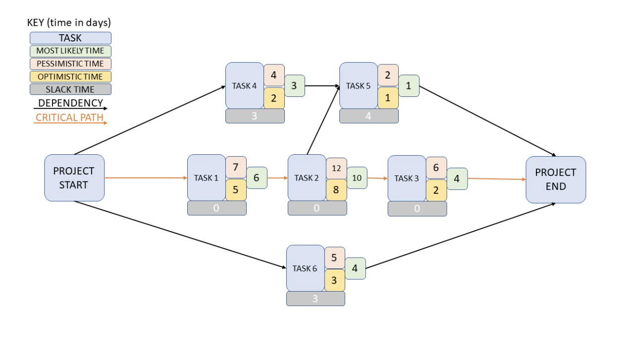
If the client or your employer has a strict due date expectation, highlight the critical path necessary to reach project closure. This helps you identify which tasks your team must complete to deliver on time. And outline slack time, which is the time available to delay a task, so you know where there’s more flexibility.
To dive into the details with your estimates, you can add pessimistic and optimistic projections. These are the maximum and minimum time amounts needed to complete an item, and averaging these out gives you a good estimate.
5. Share it, refine it
Once your document is complete, house it in a central location like a Notion team workspace, so everyone has access and can review it as needed.
And remember to host a project post-mortem where you consider what changed and what stayed the same from the initial outline. This allows you to learn from everyone’s experiences to improve future project projections.
A PERT chart example
We constructed this example using simple shapes and text in Microsoft PowerPoint. You can import PowerPoint files into your Notion workspace to create a more well-rounded view of the project.
When to use a PERT chart versus a Gantt chart
While both Gantt charts and PERT charts are visual representations of tasks for project planning, the former is great for building simple project timelines while the latter is helpful for more complex projects. Gantt charts have simpler layouts that move in one direction, showcasing only tasks, timeframes, and dependencies. PERT charts are more customizable and can move in any direction you choose. And you’ll typically create a PERT chart during the planning phase and can then create a Gantt chart to track task progress once the project is underway.
Project management made easier with Notion
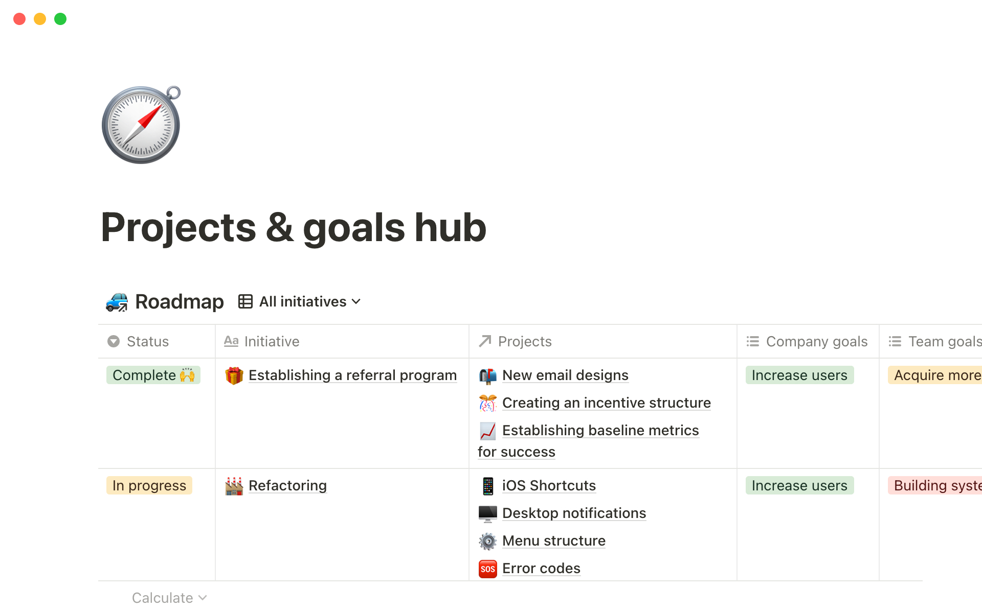
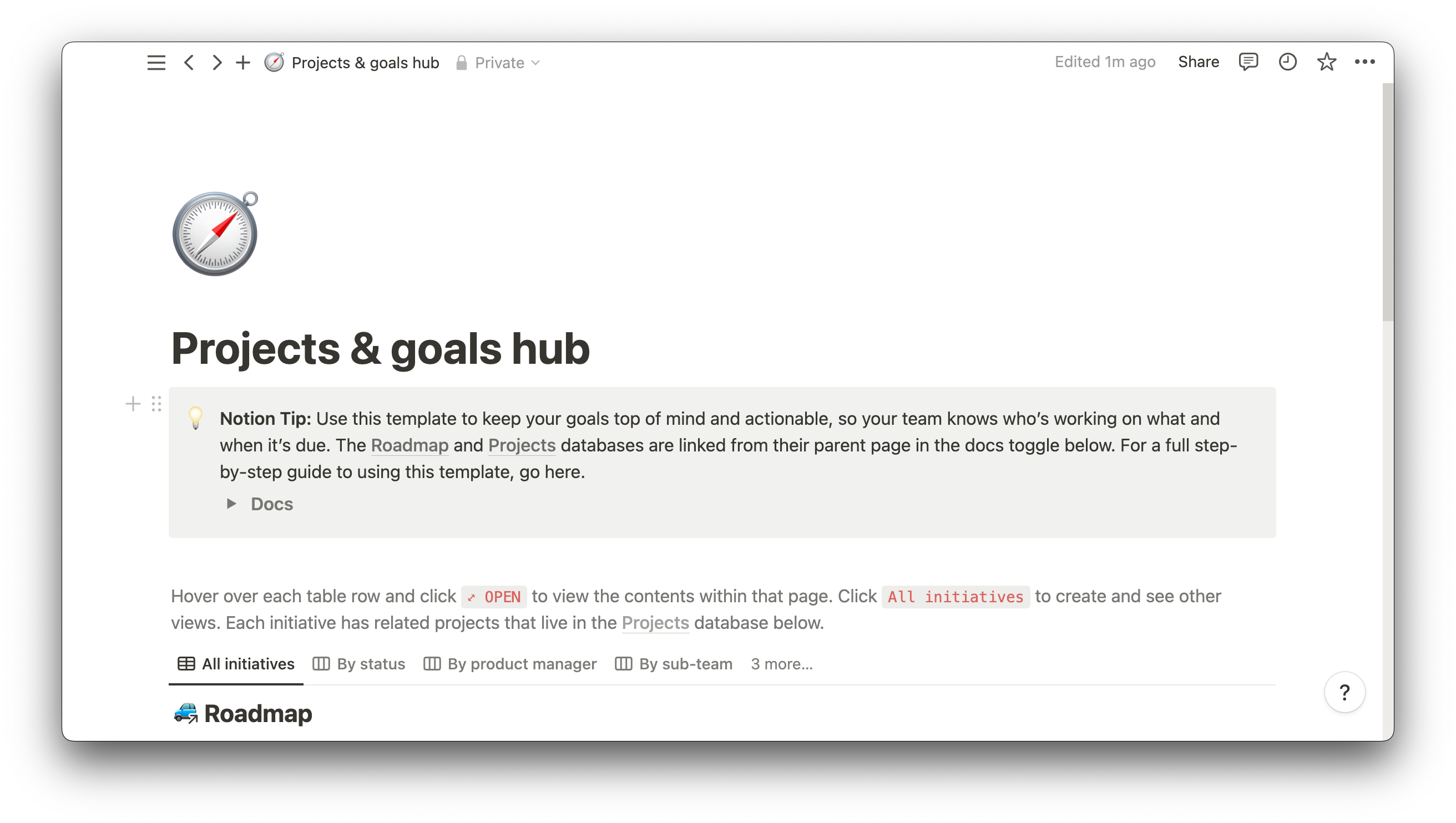
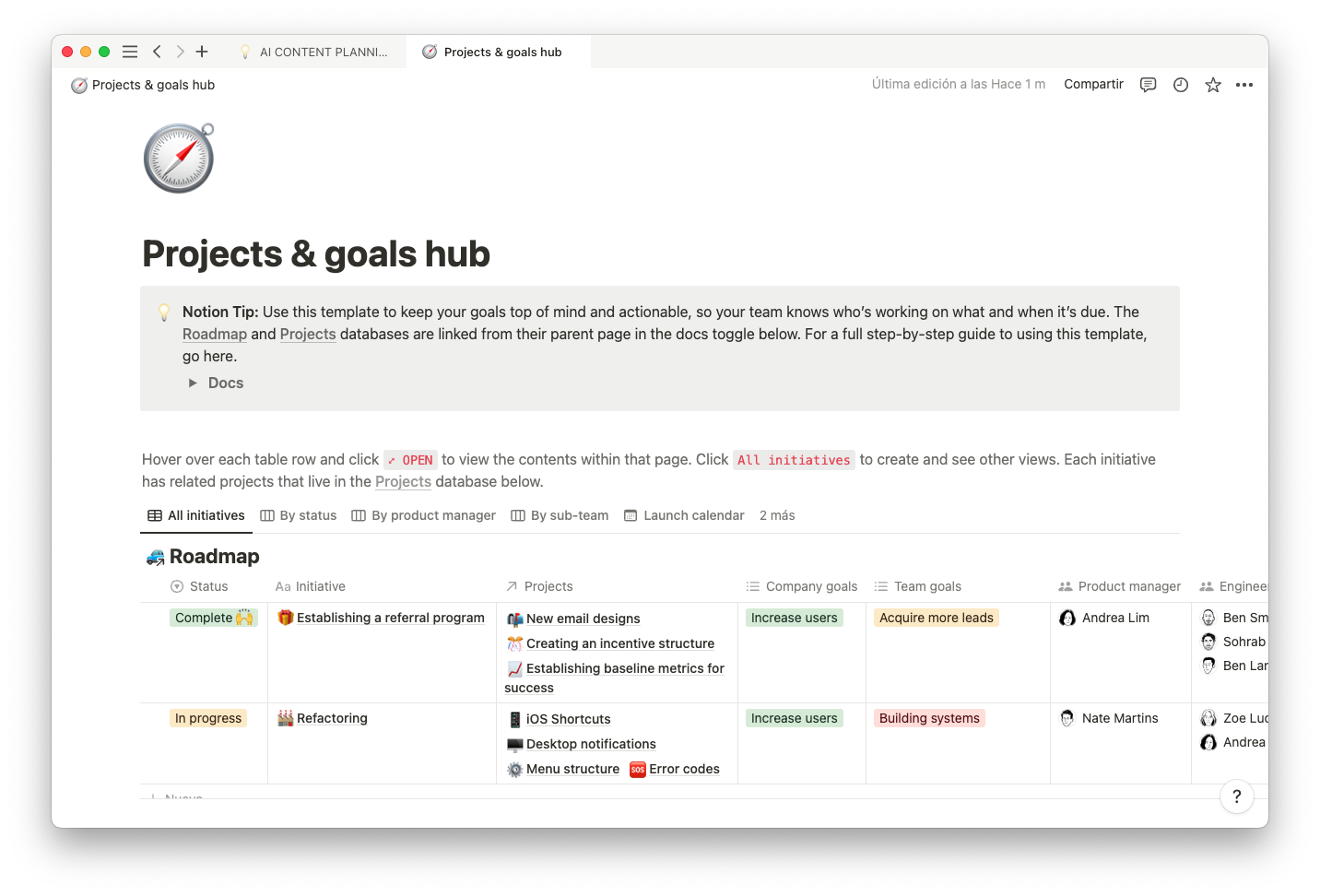
PERT charts are an excellent way to gain a thorough understanding of your project and to offer this overview to your team at a glance. You can then create all the other useful documents your team needs to succeed, like a project goals hub and employee to-do lists.
As your project approaches, begin with a Notion project management template to ease the planning process. Notion’s templates help you build PERT charts thoroughly and effectively.

