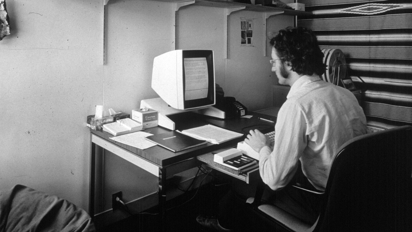
Having coined terms like hypertext and hyperlinks, the ideas of computer pioneer Ted Nelson helped define the web as we know it today. At the core of his beliefs was the desire for computers to go beyond paper — if you think about it, a word processor isn’t much different than a typewriter. The way he saw it, computers should extend our capabilities.
But many of Ted’s ideas never came to fruition. One of those was transclusion, which was supposed to be part of Project Xanadu, his hypertext model founded in 1960.
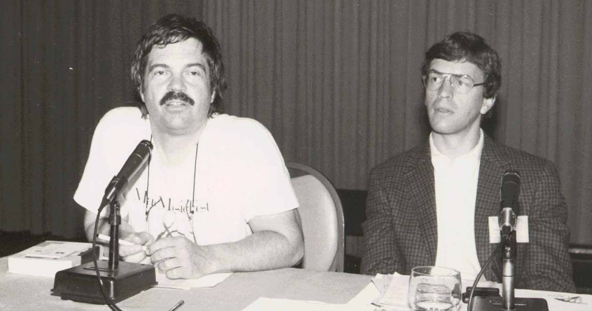
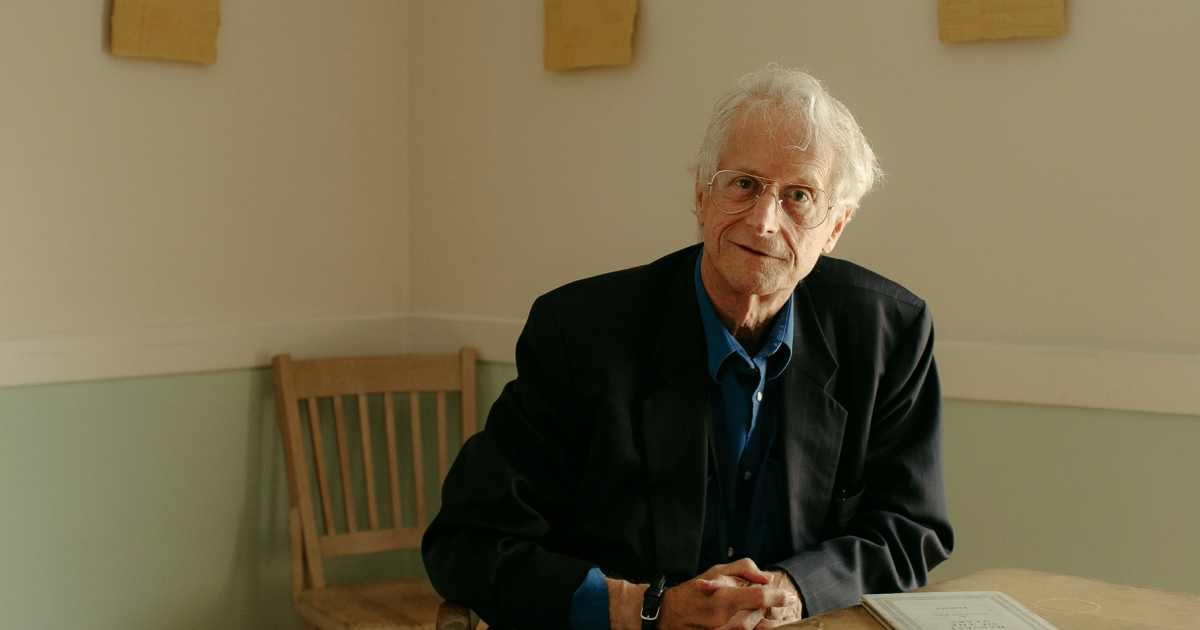
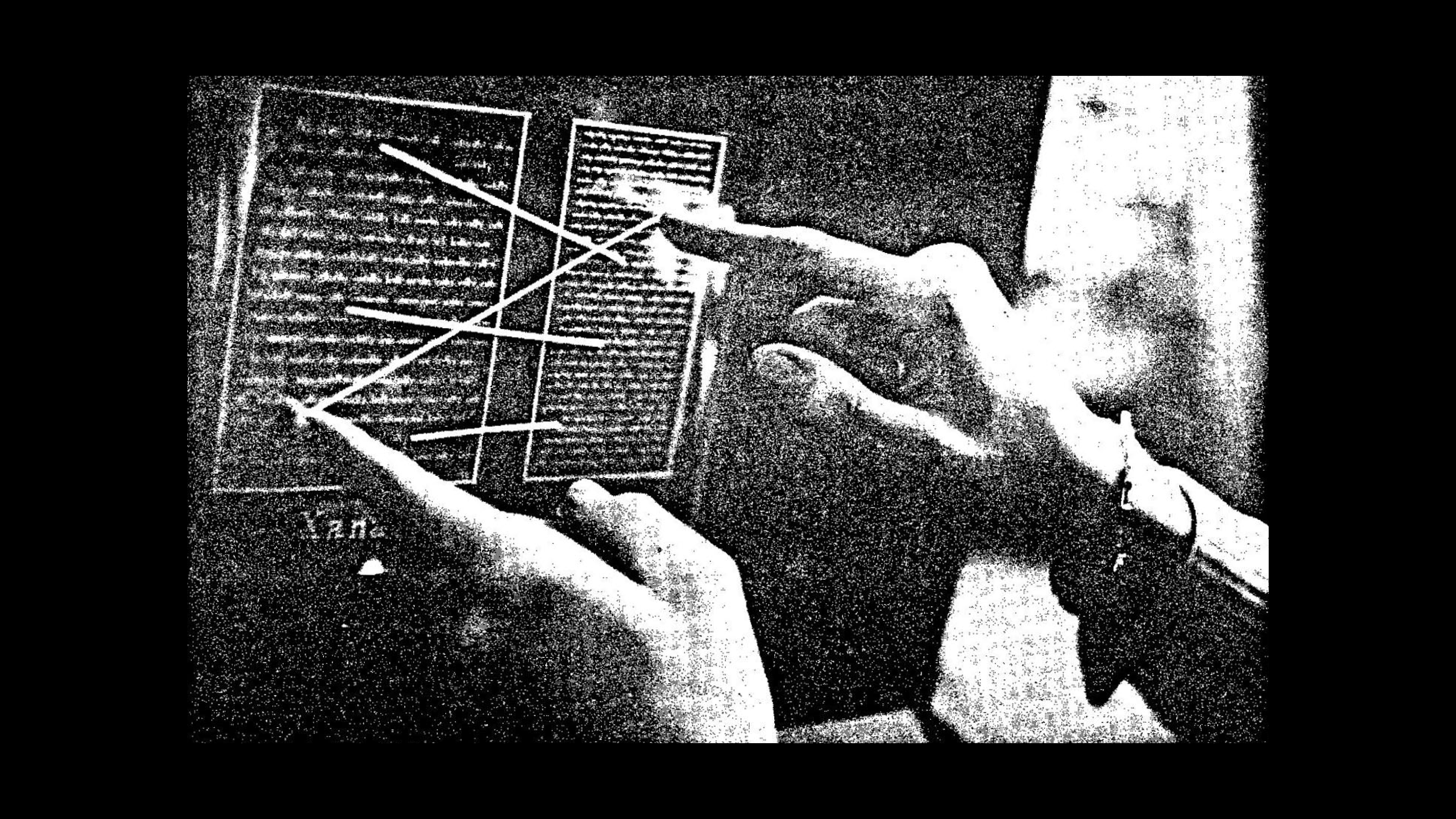
When we interviewed Nelson for our Pioneers series, he described the concept this way: “Transclusion means that part of one thing is included in another and brought from the original. In the Xanadu method, the transcluded portion has a path back to the original that you can follow.” You can see the original mockup below, and a more recent prototype of what he had in mind here.

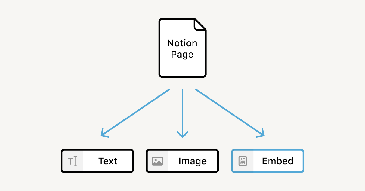
This inspired what we’re launching today: Synced Blocks. The feature is new. The idea isn’t.
What if the exact same information could live and breathe in multiple places? For example, if your company’s process for requesting time off changes, you’d probably have to find all the pages that mention the policy and manually update each of them.
Synced Blocks changes that. Instead of going through and updating the process to request time off in every page it’s referenced, turning it into a Synced Block allows you to update it once and have those changes reflected everywhere. Even though it’s a simple idea, it opens up many possibilities for how information can be structured and shared.
It’s long been a dream of ours to bring this to users. And as a designer, it’s been a dream of mine to bring it to you in a way that feels intuitive and natural so that anyone can get the most power out of Notion.
Drawing inspiration from transclusion
To implement Nelson’s full vision for transclusion, we realized we’d basically need to change the internet — having every piece of content cross-referenced and traceable. (He really doesn’t like the internet as it stands. “I don’t want to talk about the web today,” he said, during our interview. “I hate it.”)


Instead, we decided to take another approach. You can sync blocks on public pages and between workspaces, like our own little version of Nelson’s hypertext web. We hope he would like that this is making a comeback.
So, what similarities exist between transclusions and Notion’s Synced Blocks?
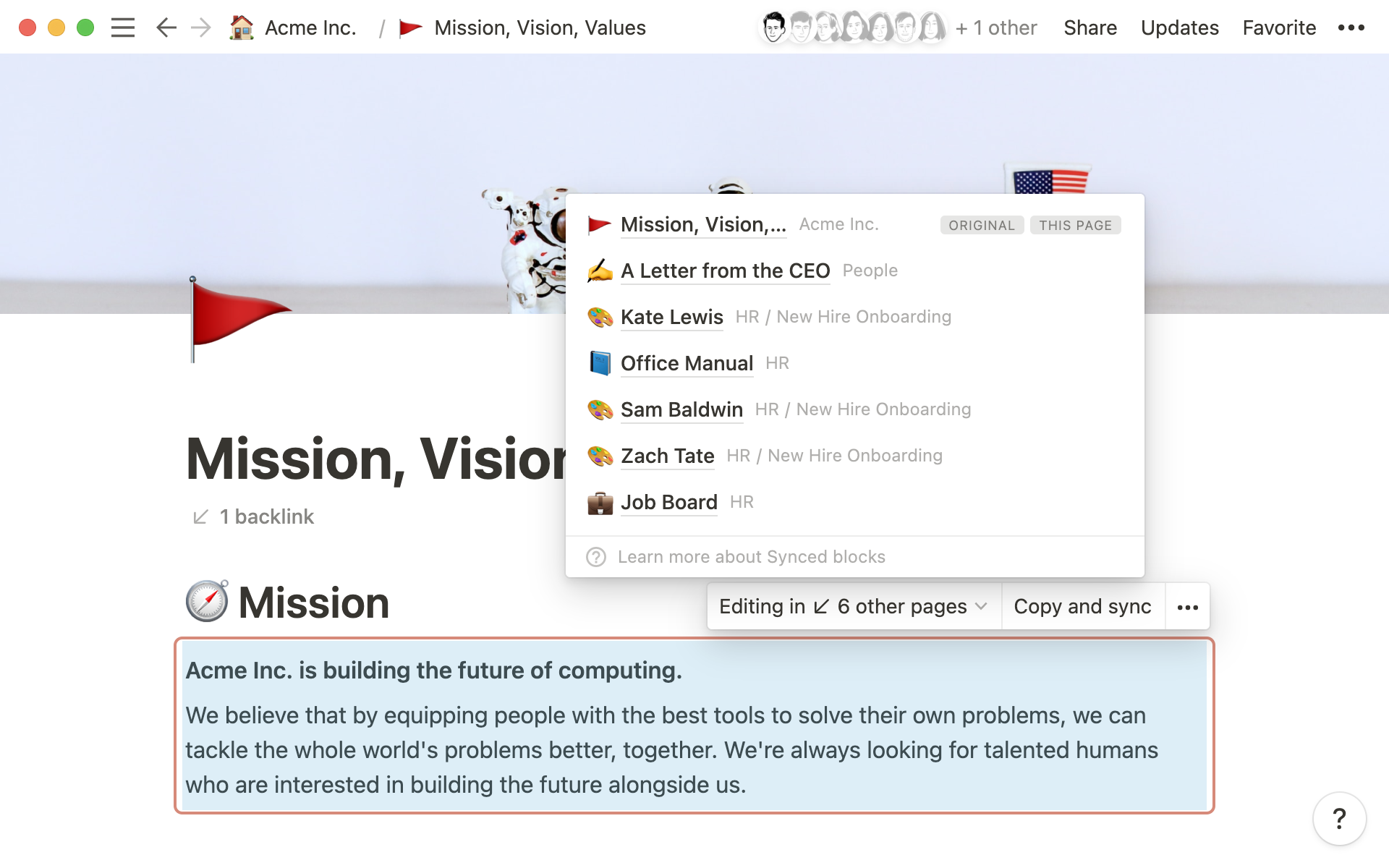
We tried to maintain that bi-directional concept at the sentence or paragraph level — in our case, the block level. We also show the paths to other places where the content is used (as Nelson might have suggested), but not in an unfamiliar or complex visual way, just in a simple list that takes you to the right place.

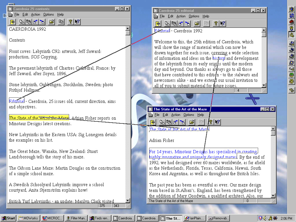
What makes Synced Blocks possible in the first place is Notion’s block-based data model — where the block is the smallest atomic unit that can be moved, transformed, or linked to other content — giving you flexibility to organize your information. In fact, Notion has always supported the ability to show an “alias” of an individual block (some of our users figured out a workaround, which you can see here).
Before Synced Blocks, you could jump between Notion pages through the sidebar and breadcrumbs. You could also use links and backlinks, both for pages and for specific blocks. But these links only served as a tool for navigating between pieces of information. Now, you can transclude one or multiple blocks anywhere.
In order to bring the concept of transclusion to a popular audience (and make it really useful for everyone), we knew our solution had to be both intuitive and simple.
Our design approach
You’ve probably used links before inside Notion, outside Notion — they’re everywhere!
Links usually go one way, pointing to a destination and taking you there. As Ted Nelson said about the internet, this creates, “a tangle of ever-breaking one-way links, breaking whenever documents are moved or modified.”
To me, a link is simply a relationship between objects. One-click, one-way hyperlinks are the most obvious and popular, so they’re everywhere. Less obvious, more complicated concepts like backlinks and transclusions never caught up. We wanted to fix that.
Simplifying the complex
The simplest solution takes the most time to create. When the first iPhone launched, Copy and Paste was absent until Apple got the interactions to feel right two years later. They had to make sure the feature was fit to the medium so people could use it without thinking or learning too much.
For Synced Blocks, the biggest design challenge was making sure anyone, no matter how technical, could naturally discover the concept and immediately understand it while using Notion.
The primary path to discover Synced Blocks is by copying blocks from a page and pasting them into another, a concept created by Larry Tesler at Xerox Parc. When it comes to text editing, most of us can’t live without Copy and Paste. It’s simple and intuitive because it traces back to how people used to do things in physical space — and that entry point changed how people interact with text in virtual space forever.

Ted Nelson might disagree, as he thinks the computer world is, “built on crude traditional models,” including, “paper metaphors.” But the thing is, not everyone will immediately understand a new way to do things. This reminds me a lot of A Pattern Language — in order to make a complex concept easily understood, we needed to build on simpler, more well-known ideas and patterns.
So we borrowed the existing idea of Copy and Paste as a common mechanism to make Synced Blocks intuitive and accessible the first time someone discovers it.
I also knew the packaging of Synced Blocks needed to entice discovery.
Making the simple attractive
When starting work on Synced Blocks, I thought about making a hammer — it was once a new tool that is now ubiquitous, feels perfect in your hand, and is used for many purposes.
For Synced Blocks, the ergonomic problem was making it feel like part of the page when viewing, while also making it clear to editors that changes would affect other places. Plus, a Synced Block is really only a container for blocks, adding to complexity in display, structure, and block-level interactions.
To make it feel comfortable in the hand, we iterated constantly.
The first version felt too separate from the rest of the blocks on the page, which then resulted in some layout difficulty (extra spacing around the container, positioning of the overlay, etc.).

To eliminate the layout problem, we built a prototype of the sync container by incorporating padding and controls inside the Synced Block when editing. That resulted in problems with narrow columns, and it felt a bit clumsy with the repositioning of the text when moving in and out of edit mode.

After testing the prototype internally, we felt it wasn’t good enough, so we tried more ideas and iterated. We then granted access to Synced Blocks to a group of Notion power users, seeing some of the real-world issues they faced when using the feature, like alerting Synced Block editors of permission mismatches.

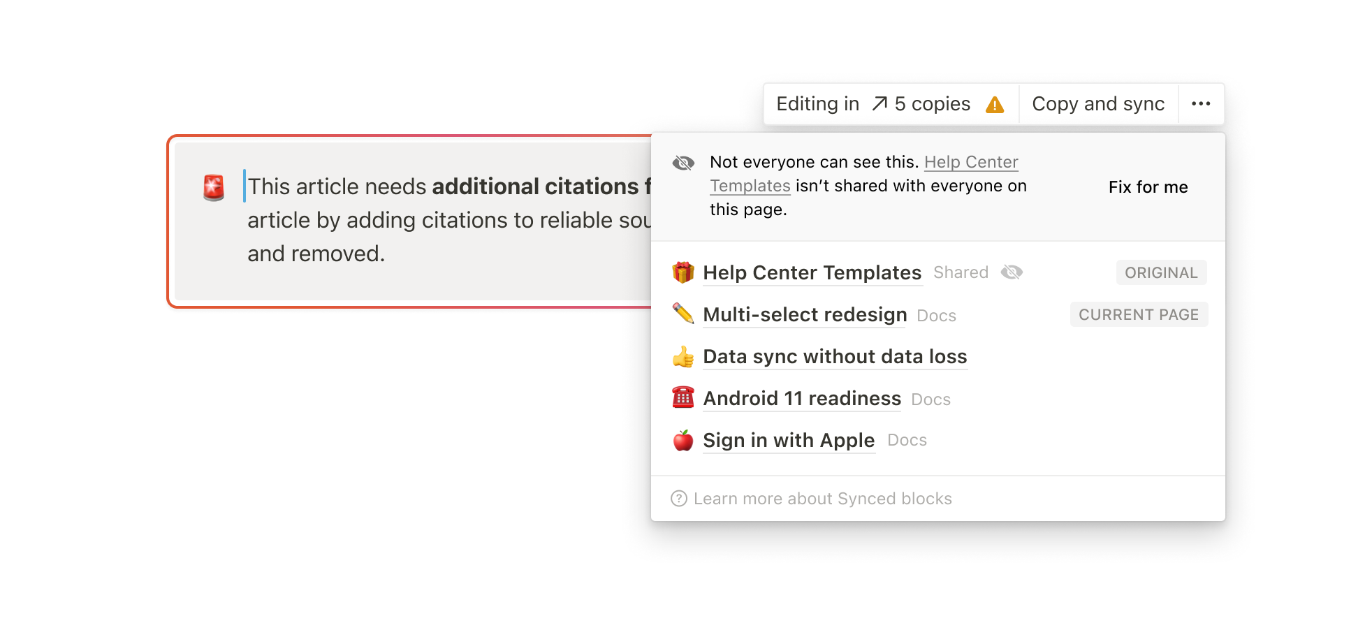
Eventually, we landed on something much lighter — a halo around the Synced Block that wakes as you near it, and gets brighter when editing affects other pages. New users should notice something’s different with these Synced Blocks as they pop up inside their workspaces. I thought a lot on how to get people discover this naturally when they move their cursor through content, finding a Synced Block, trying it, and understanding what it is. That’s also why the menu is so streamlined, showing only what’s necessary to viewers and editors.
To end up at the final version, we needed to feel the feature. Were the light aspects — like seeing a Synced Block the first time — intuitive and delightful? Were the heavy aspects — like surfacing warnings on edit and deletion — supposed to feel this heavy?
What started as a high-level concept needed rounds of use and iteration before whittling it down to only what was necessary, making that as simple as possible, and polishing what was left.
New ways to connect information now, and moving forward
This version of Synced Blocks isn’t yet in its final form, what it can be, what it will become. We hope to develop more functionality for our users to transform information at different densities.
But for now, teams and individuals can use Synced Blocks to tie threads between their pages, or build entire pages made out of Synced Blocks. Imagine your project update as a Synced Block — when you update it, it’s updated in every document and objective where it’s referenced. Or a sophisticated company internal site with navigation and announcements that are shared across pages. When one thing changes, Synced Block updates all of its copies.
We believe if every business and person can tailor software to their problems, the world will be better at solving its problems. Our mission is to make this a ubiquitous reality. Features like this give you more power to customize information, taking steps to realize what early pioneers thought computing could be — breaking out of the mold of physical tools to better augment human intelligence. Small steps, but at least we’re on the way.