You can also read it on Medium.com:
Why Is Modular Scale a Good Idea in Typography?
Sometimes asking an oddly obvious question helps clarify things for me. Here is one: why is modular scale a good idea in typography?
One easy way to form typographic contrast is by using different font sizes. Even with every other property set to be same, font size difference alone can create distinctively different text styles for title and paragraph, etc. However, changing font size isn’t always an easy task in history.
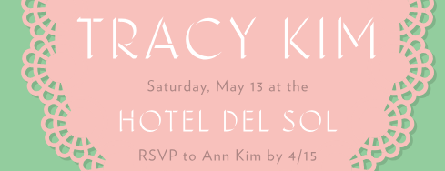
“TRACY KIM” and “HOTEL DEL SOL” are in the same font setting except the size. The font size difference is enough to create contrast and visual hierarchy here. Image from Discover Typography
In metal type era, a different font needs to be made for a different size. To make things easier, type industry agreed upon on a standard scale for type sizing. Over the following 400 years, the scale survived with little change and few additions. This scale becomes the constraint as well as a handy tool for generations of typographers. You can still see it being used in today’s software such as Microsoft Word.
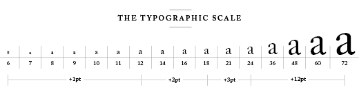
Typography scale from metal type era, reproduced as dictated from The Elements of Typographic Style. Image from retinart.net
In his book The Element of Typographic Style, Robert Bringhurst advises readers “Don’t compose without a scale.” Having a typographic scale does more than just limiting yourself to a sane number of options, it also provides underlying harmony, just like the musical scale. The modular scale is created based on the same concept as the musical scale to create harmonized contrast.
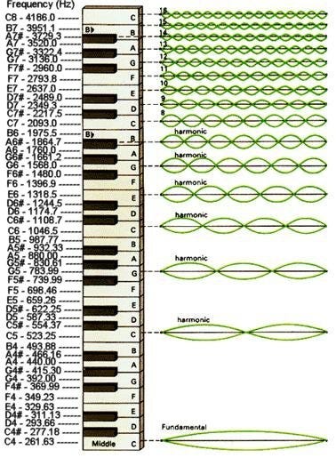
Musical scale frequency visualization. Image from universe-review.ca
In musical scale, A4 note’s physical frequency is 440HZ, exactly half of A5’s 880HZ and fourth of A6’s 1760HZ. With modular scale, for example, typographers set title size to be exactly 1.5 times bigger than subtitle, and subtitle to be exactly 1.5 times bigger than the paragraph. That common ratio 1.5 is the magic key to forming harmony in this mini design system. However, visual harmony is not the only reason the modular scale is a good idea in Typography.
If a pan is not 1.4 bigger or smaller than another pan in your kitchen collection, you probably don’t need it.
Researchers did studies and data analytics on people’s kitchen pan sizes, what they found out is that in an average person’s kitchen, one pan is generally 1.4 bigger in diameters than another pan. It means if a pan is not 1.4 bigger or smaller than another pan in your kitchen collection, you probably don’t need it. The pan size phenomenon goes the same with font sizes as well. If your next font size is not that much bigger or smaller than existing size in your design system, you should reconsider the necessity of adding it. By employing a modular scale, you ensure every font size in you design system exists because of necessity and no unnecessary font size gets added.
[A set of pans in different sizes. Each pan is significantly bigger than the next by a certain ratio.](https://miro.medium.com/max/334/0*AOCfo7WA8KCTlUeJ.)
A set of pans in different sizes. Each pan is significantly bigger than the next by a certain ratio.
The modular scale is a valuable tool to make a harmonious and lean font size system. It is a good idea to use a modular scale in your typography work.
Screenshot taken from modularscale.com