You can also read it on Medium.com:
Getting fluent at the language of iconography
You see icons everywhere now, in websites, in apps, in software. It is an essential part of UI elements. UI is a language, so is iconography. In fact, some icons are verbs, some are nouns.
Iconography is so close to our traditional language system, that referring iconography as a language may differ from referring UI design as a language, because the latter is more of a metaphor and the former is more literal. So literal, that we create fonts for icons now, just like we do with text.
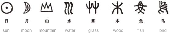
In fact, in the early years of human history, you can’t really differentiate icon from text, they are ultimately the same thing:
Ancient Chinese
Each icon has its meaning. But unlike word, which most of the time has multiple meanings, each icon only has one meaning. That is why it is becoming more and more popularly used in UI design. UI should be clear, no double meaning, and icon has it in its nature.
Another advantage icon has over text in UI design, is its universalness. You don’t need to translate it to other languages, everyone understands it.
Like how our nature languages got developed thousands of years ago, iconography is going through the same process. Gradually the language gets richer, gets larger and larger vocabulary, and then a system will emerge – the grammar. Currently icon is at its early stage, where the language is growing its vocabulary. The noun project did a great job making this a team effort using crowd sourcing.
[The noun project, search results of “menu”](https://miro.medium.com/max/882/0*ETsh7Wqw_u-v4Mwh.)
The noun project, search results of “menu”
When search “menu” at the noun project, you will get multiple results. These different interpretations of the same icon is equivalent to the same word set in different typefaces:
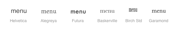
The same word set in different typefaces
It is not equivalent to saying the same word “menu” in different languages as “menu”, “菜单“, “menú”, “valikko”. Ultimately iconography is (or will be) one single language that is world wide universal, despite culture and geography differences. And that is beauty of it.
Android icon system and iOS icon system shared some glyphs, for example, the hamburger icon for menu:
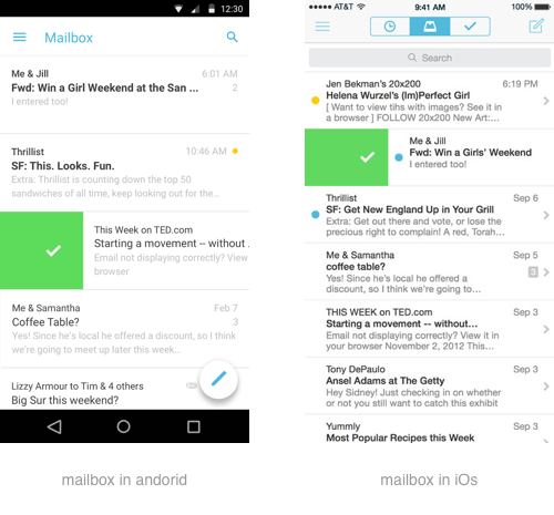
Mailbox app on iOS and Android both used hamburger icon for menu
but they also have their own special glyphs that the other one doesn’t have the equivalent, such as android’s three vertical dots icon (joke name: kebab menu)
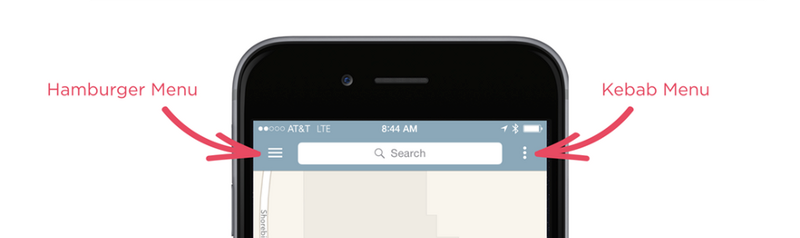
image by Luke Wroblewski