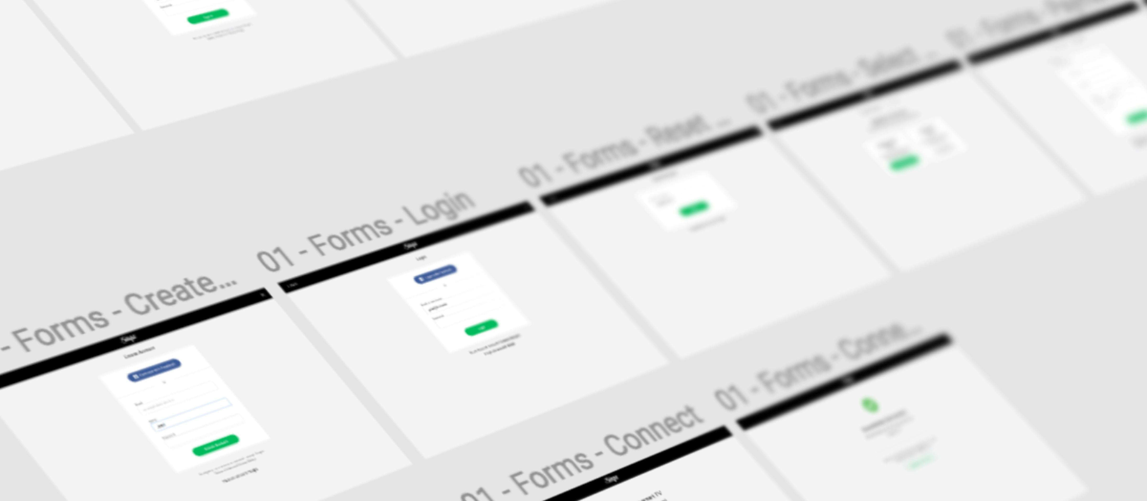
I was hired as a full-time product designer. I was responsible for UI/UX of all apps (BTB and BTC) on various platforms. I also assisted sales and marketing teams with graphical assets and videography. When I first came to Singa, I had to detect friction points and downsides of products, and I did that using analytical tools at my disposal. Once I detected what was keeping sales from going up, I revamped information architecture and provided refreshed designs while at it. After all, changes went live, the growth trend started to have a steeper line upwards. During the redesign, I created a design system and brand guidelines to consolidate resources and provide a single truth source for all team members.
I had to revamp iOS, Android, and web apps. I started with the web since Google Analytics contained the most information about users. I immediately detected that most audience wants to search for the song, and search functionality was buried in the interface three clicks away. A personal profile was very confusing because different buttons opened the same views. It was tough to upgrade to a paid subscription. There was no clear path to do that, and downgrading was hard to find and generated many customer support tickets. The overall design seemed outdated and inconsistent. This was a top-level audit, there were more issues that I resolved along the way, like consistent typography and spacing.
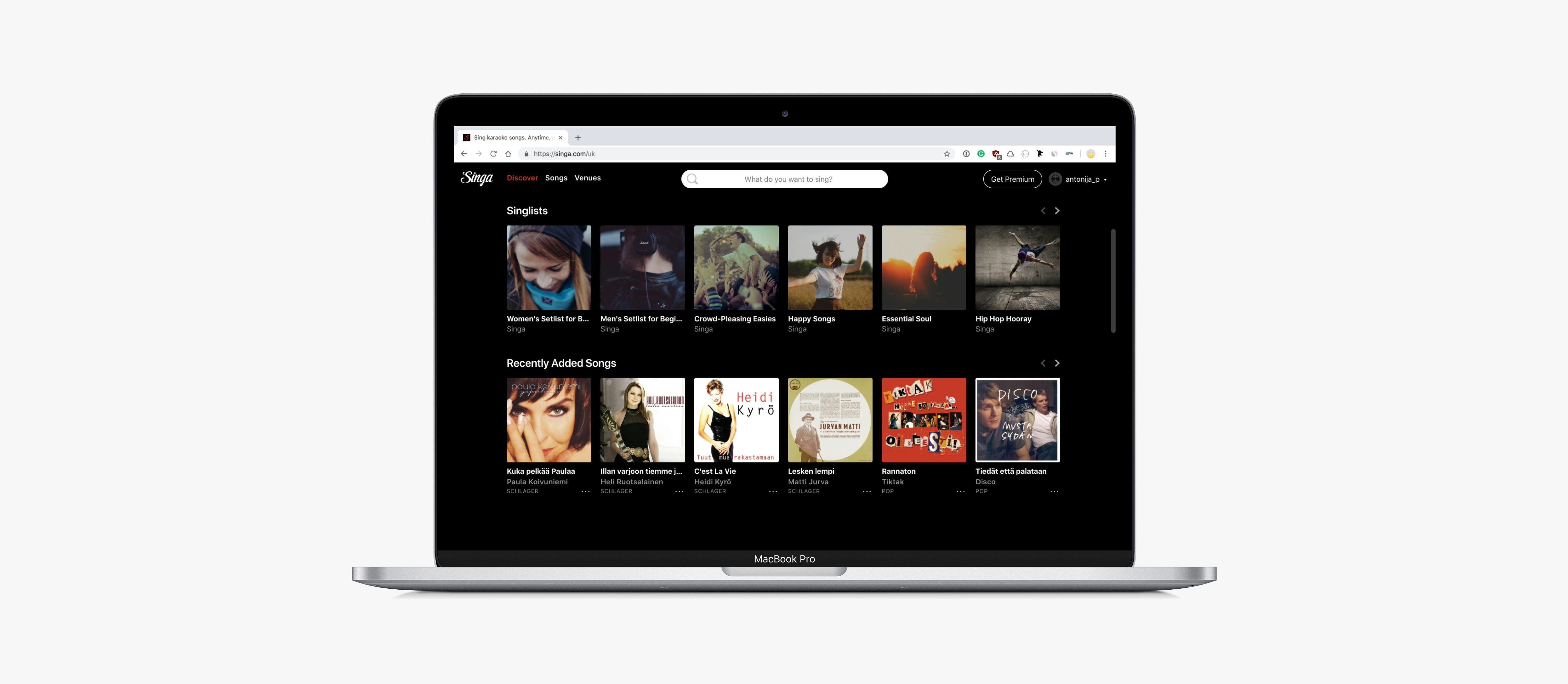
The most important thing was to declutter navigation and offer search on the landing page since most people just want to search for a song they want to sing. I realised a registration form has one input that is not utilised anywhere. After talking with developers, we decided to hide the username field and generate it in the backend. Now registration success is around 96%. The profile section is now completely redesigned and has much more functionality. Recently, we have a proper off-boarding flow to reduce churn and help users resolve potential issues that might lead to service cancellation. Other improvements include a new modern typeface, a grid system, a new payment form, etc.
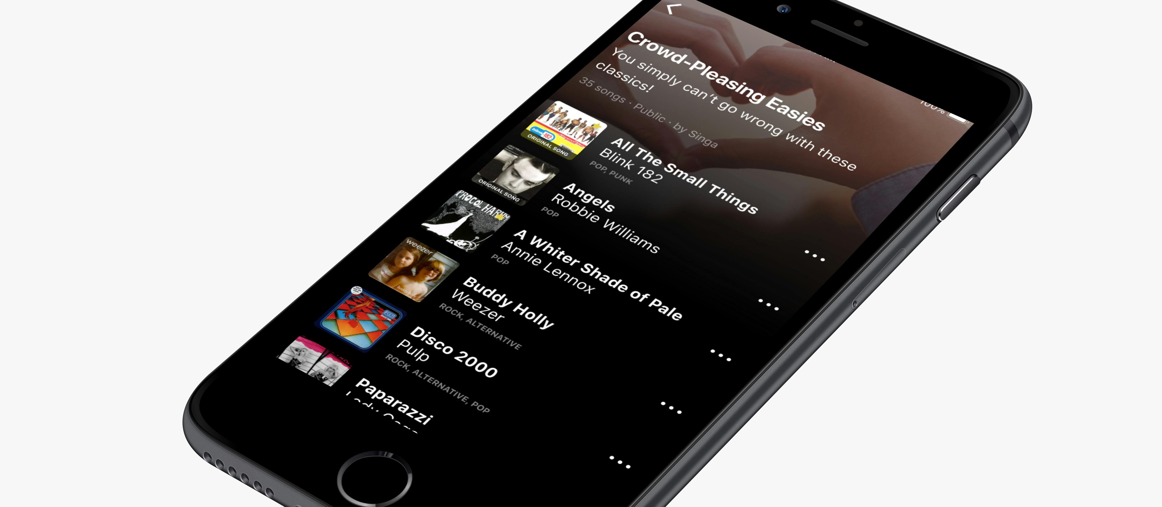
As in the web, navigation was tough to use, and it needed to be redesigned to elevate user experience to the next level. It used to be hamburger navigation with a whole search functionality crammed into a side-panel that took less than 50% of screen estate when active. I switched to a tab bar navigation and made search prominent as a separate tab bar item. Since search is crucial to Singa, I updated the search results' design to reflect the newest trends and best practices.
After a few months of hard work, numbers started to grow on all platforms. iOS had the biggest growth. The app even got picked up by Apple in their collections that drove even more users.
Along with mobile and web apps, there is a professional iPad app for BTB clients, Apple TV and Android TV apps, and a small web app for sending song requests to KJs from within venues with the Singa PRO system installed.