
There are different Shift View colors which give users visual feedback about the production process. Below you will find explanations of what the colors indicate.
Green indicates that the production line/machine is running within the set norm. The set norm is based on the defined ideal cycle time in Settings. Each individual product has an ideal cycle time and the system recalculates the norms each time the user makes a product changeover.

The timeline is yellow when the real cycle time of a product (registered via sensors or PLCs) is between ideal cycle time and stop start time. These blocks visualise the time that the cycle took longer than specified and are considered loss due to production speed (e.g. performance loss).
For example: for “Product 1”, the ideal cycle time is 2 seconds per product or 30 products per minute or 1800 products per hour. If a product actually registers in every 3 seconds, then there is 1 second of speed loss and 2 seconds of production within the norm. That 1 second we count as performance loss.
Now to keep the Shift View a bit cleaner and use less network traffic, the system is counting 30 products per circle (it is possible to adjust the value but usually it is so that you can see one circle per minute). This causes small averaging of the yellow areas. It means that the cycle time is also multiplied by 30 and the yellow blocks of these 30 cycles are summed together. So if we use the same example, the user would see 230 = 60 seconds of green and 130 = 30 seconds of yellow.

Darker yellow represents the commented speed loss areas:
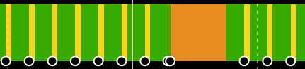
If the time between two cycles exceeds the stop start time (which can be defined for each product separately), then the yellow turns red.
Red areas indicate the time between two cycles of a product that exceeds the set stop start time. These areas are production stops and we consider them as availability loss. Operators should comment on the red areas to understand what the causes for production downtime are.

Indicates unplanned production stops that have been commented by operators. They are all considered as availability loss (real cycle time exceeds production stop-start time).
