Visualizing user attitudes and behaviors in an empathy map helps UX teams align on a deep understanding of end users. The mapping process also reveals any holes in existing user data.
As UX professionals, it is our job to advocate on behalf of the user. However, in order to do it, not only must we deeply understand our users, but we must also help our colleagues understand them and prioritize their needs. Empathy maps, widely used throughout agile and design communities, are a powerful, fundamental tool for accomplishing both.
Definition:
An empathy map is a collaborative visualization used to articulate what we know about a particular type of user. It externalizes knowledge about users in order to:
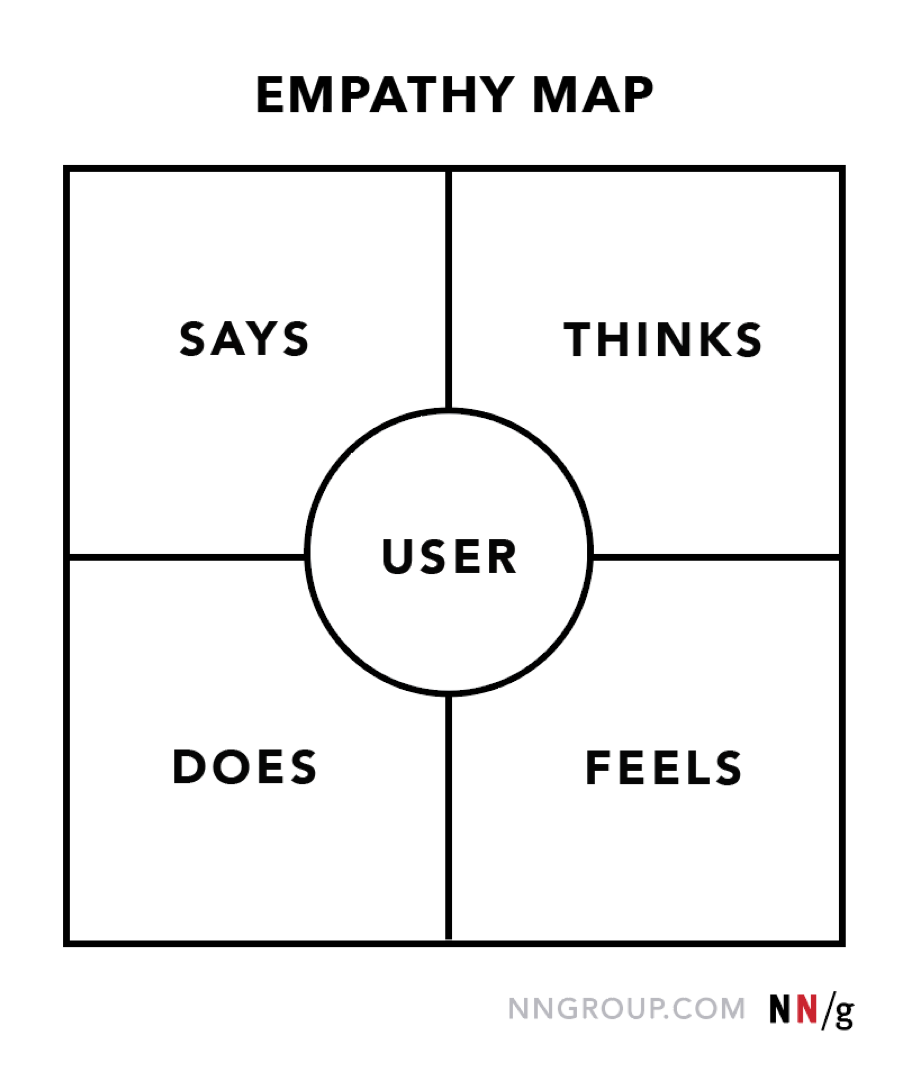
Traditional empathy maps are split into 4 quadrants (Says, Thinks, Does, and Feels), with the user or persona in the middle. Empathy maps provide a glance into who a user is as a whole and are not chronological or sequential.
The Says quadrant contains what the user says out loud in an interview or some other usability study. Ideally, it contains verbatim and direct quotes from research.
The Thinks quadrant captures what the user is thinking throughout the experience. Ask yourself (from the qualitative research gathered): what occupies the user’s thoughts? What matters to the user? It is possible to have the same content in both Says and Thinks. However, pay special attention to what users think, but may not be willing to vocalize. Try to understand why they are reluctant to share — are they unsure, self-conscious, polite, or afraid to tell others something?
The Does quadrant encloses the actions the user takes. From the research, what does the user physically do? How does the user go about doing it?