Flash of Unstyled Text
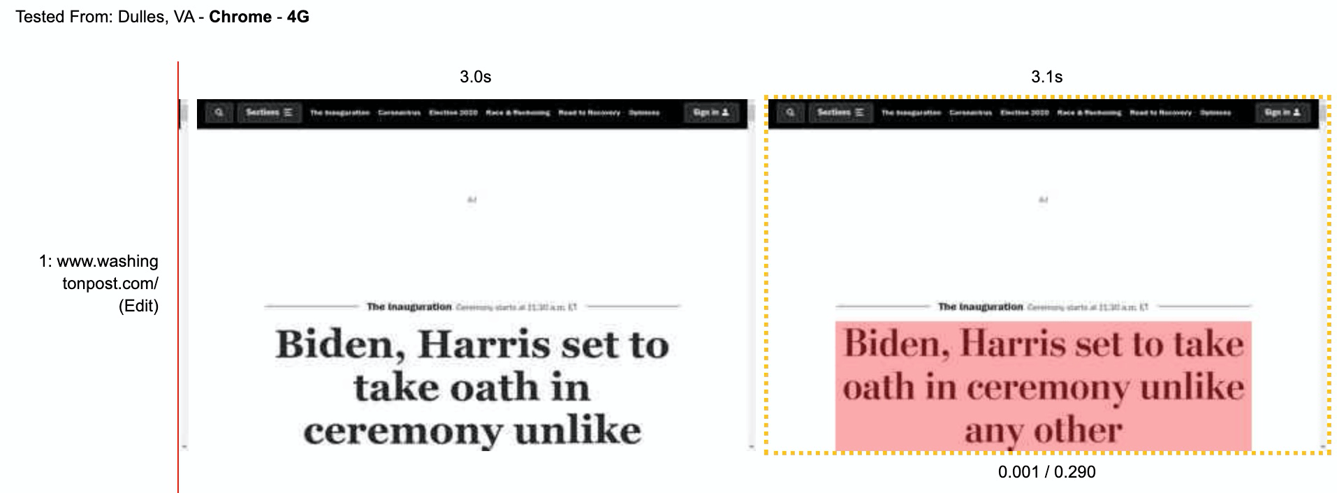
Headline web font loading causes a layout shift. View test on WPT
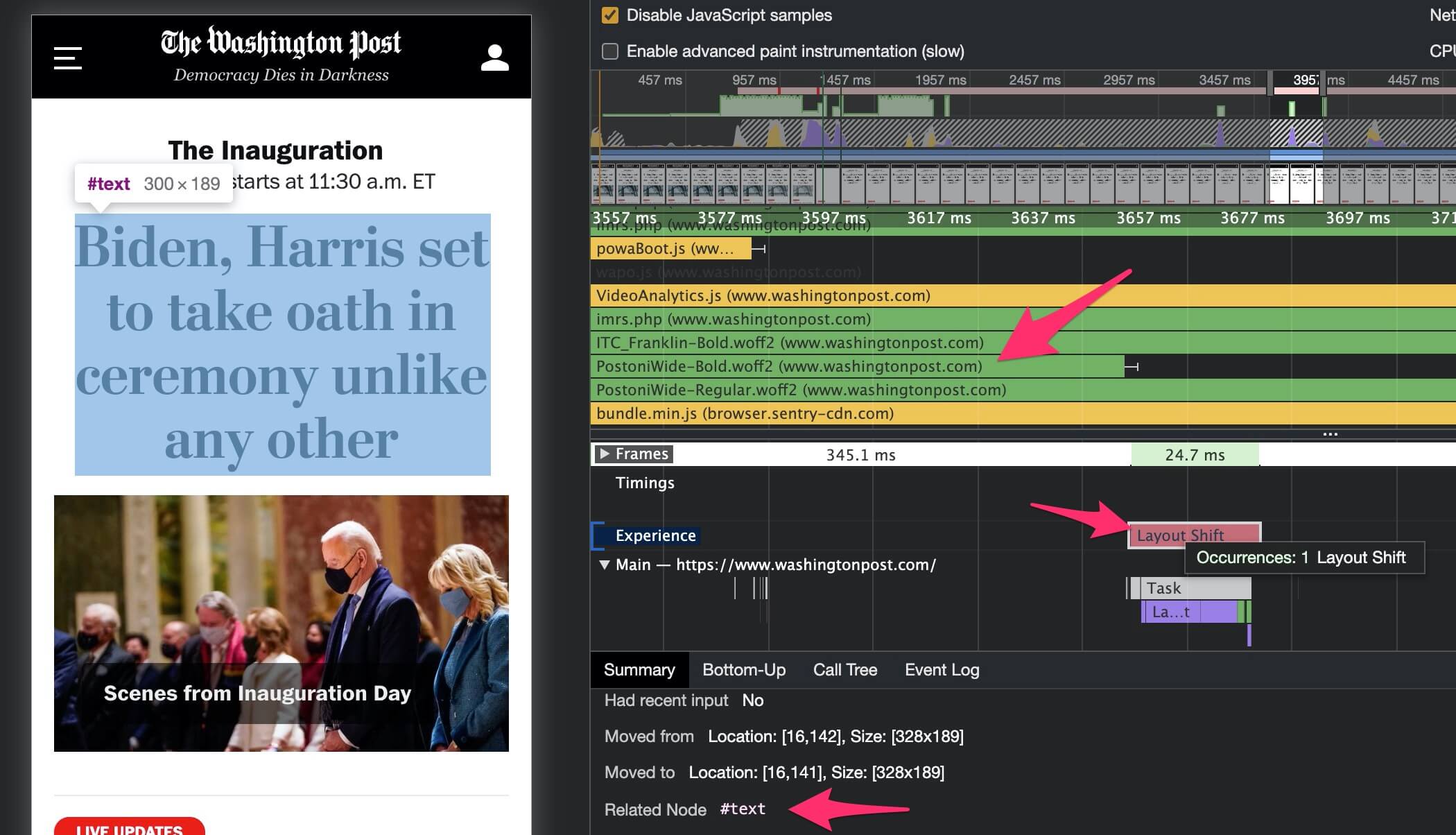
Chrome developer tools shows attribution of layout shifts
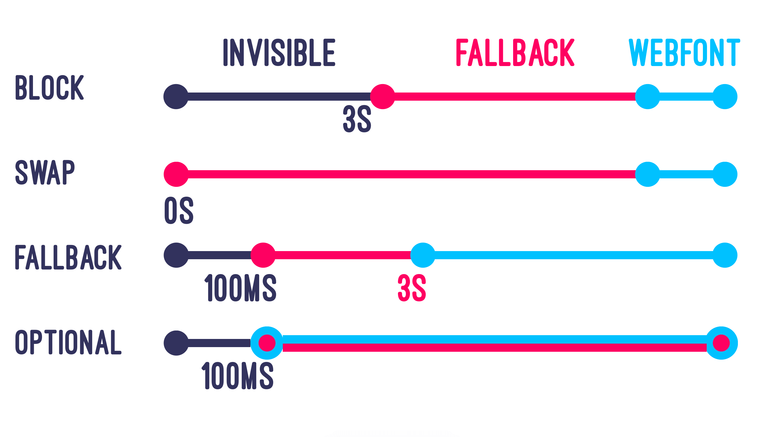
Optional is the only font-display value which guarantees no layout shift. Image by @notwalforf. Read more on MDN
Downloading one or two font files to render text won’t have a massive impact on speed, downloading five or ten font files will! Ensuring that you deliver the minimium viable number of font files is the best way to ensure that the browser has them available at layout, thus reducing the likelihood of FOUT layout shifts. Let’s look at some tricks to load fewer font files while maintaining your design.
Designers hate this one weird trick!
Font stacks generally include a bunch of different files, from extra-light italic through to extra-bold. Combining nine font weights with normal and italic variants produces 18 separate font files! Fonts that are not used on the page will not be downloaded, but for the odd occasion where only a single word is both bold and italic (for example) the whole font file will be downloaded to render the single word.
Browsers can make bold and italic versions of fonts themselves, this is called faux bold and faux italic. This could mean that a single regular weight font file is all you need! This should be tested and approved by any designers involved, I recommend a blind Coke vs. Pepsi style test to prevent any bias impacting the outcome.
Example of differences between faux and real bold. source
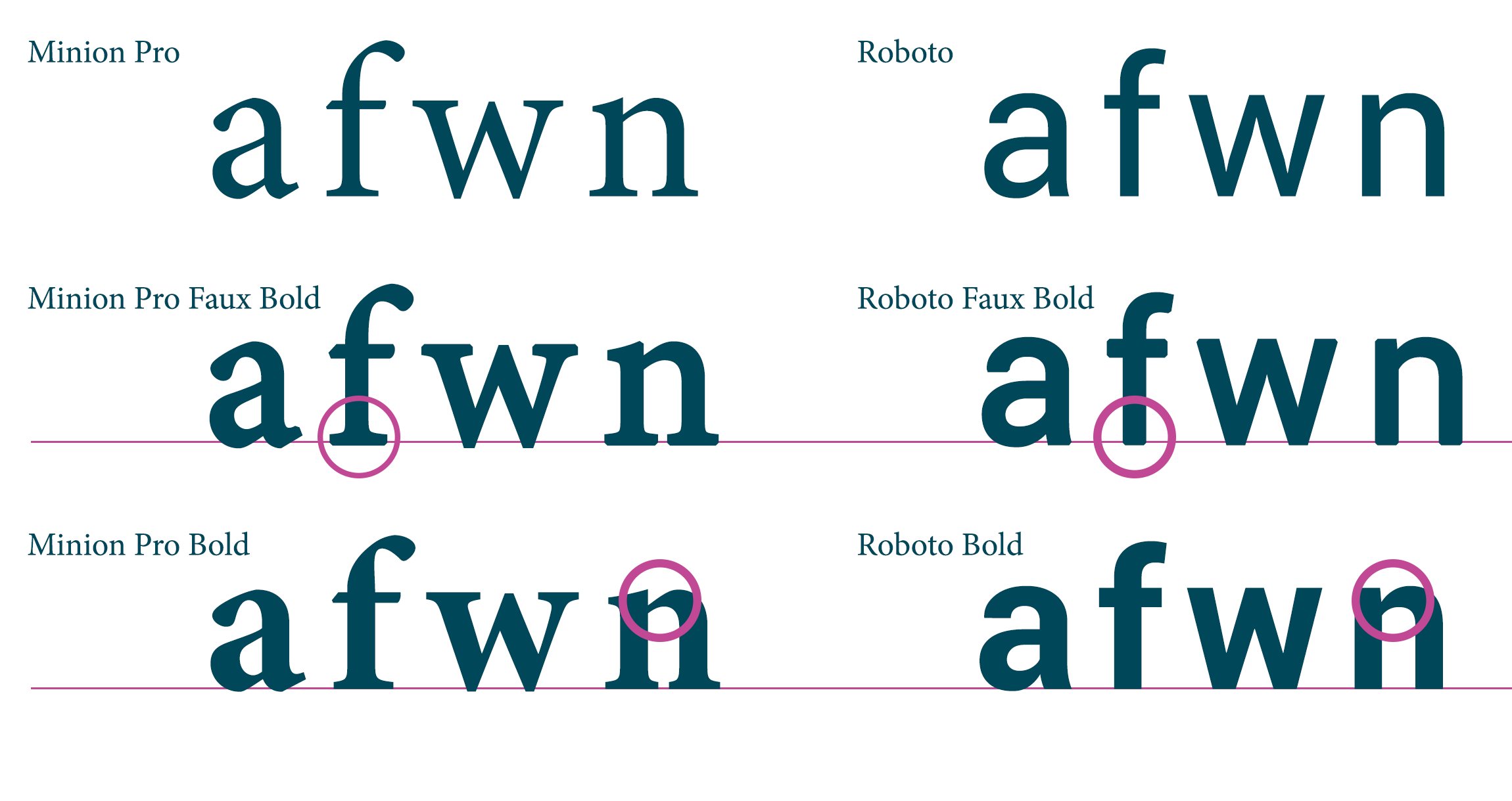
There may be subtle differences between the browser’s version of a bold font and the font creator’s version, as shown above. For some fonts the differences will be too great to consider, especially fancy ones! You can check yours by simply removing the @font-face declarations for all but the regular font version and comparing screenshots of rendered text.
All modern browsers support variable fonts (notable exceptions are IE11 and Opera Mini), this allows a single font file to include multiple variable axes like font weight and slant. This results in a larger file than a single weight font, but it replaces multiple weight files and provides more flexibility for the variable axes (e.g. font-weight: 457).
Variable fonts can be found in multiple places, for example Google Fonts has a filter to only show variable fonts. The majority of variable fonts have a single variable axis for weight, but there are a number of possible dimensions including slant, serif and optical size. Exo for example has both weight and a binary italic dimension. Axis Praxis is a great place to explore the possibilities of variable fonts.
Icon font sets like Font Awesome and Bootsrap’s glyphicons have popularised the use of web fonts for iconography. Unfortunately this means that your icons will not render until a (typically) large font file has downloaded, and sometimes results in an unsightly symbol instead of your icons when the font file fails to download in time.
Icon fonts are bad practice for performance and accessibility, replace them with SVG as soon as possible.
N.B. this section is named after the great talk given by Seren Davies: Death to Iconfonts ☠️
Web fonts are popular because they allow designers to maintain a consistent look and feel across browsers. Where this isn’t necessary, system fonts will be the fastest method to render text. If your current web font is close to a system font, you can use Font Style Matcher by Monica to tweak the font settings until you get a near-perfect match. I’ve worked with a client who surreptitiously replaced their web font stack with a tweaked system font for two weeks - neither designers nor customers apparently noticed the difference!