Different colours can have different connotations, depending on context and culture. Colour in media products can also be manipulated in a variety of different ways. Colour can be controlled via lighting, through the setting and mise en scene, and especially now, controlled in the editing process.
Media products may have a colour palette, a set of colours that are used consistently throughout to create a tone or mood.
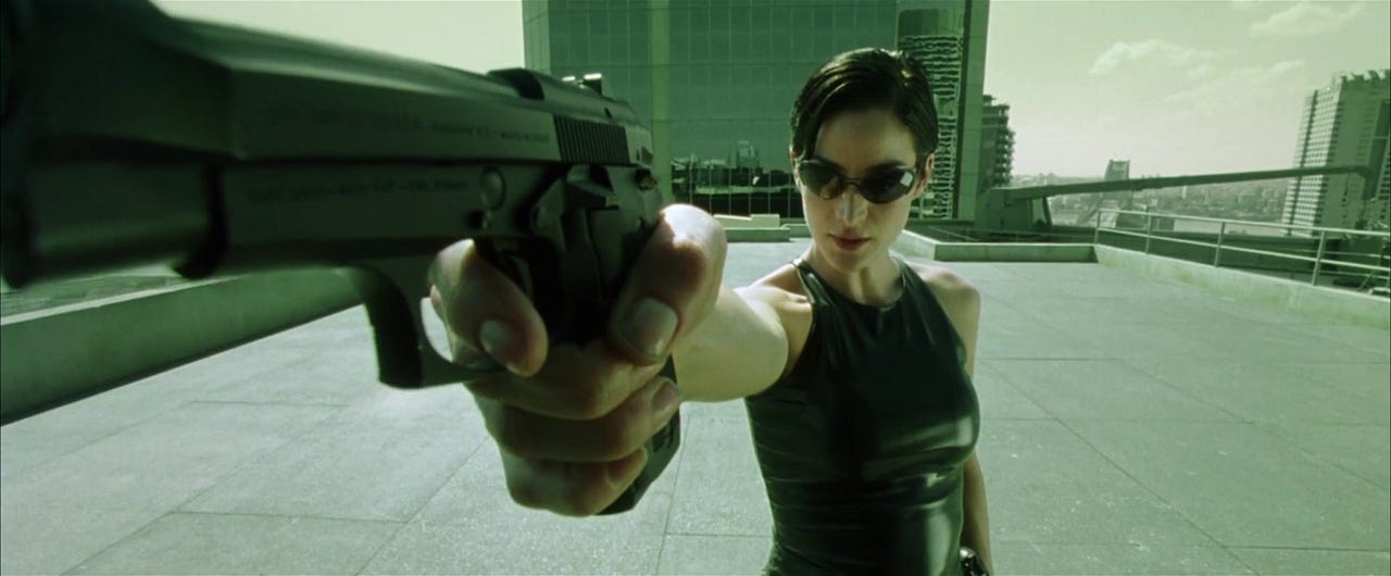
The dominant colour of a shot within a mise en scene or throughout a media product has the effect of setting the mood or tone. For instance, i the screenshots below, the dominant dirty green colour of the ‘fake’ world within The Matrix creates a mood that the world is “sick” whilst the screenshot from ‘In The Air has a dominant colour of a cold blue, which is sets an overall melancholy mood.
‘The Matrix’ (1999)
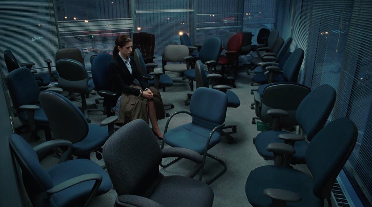
‘Up In The Air’ (2009)
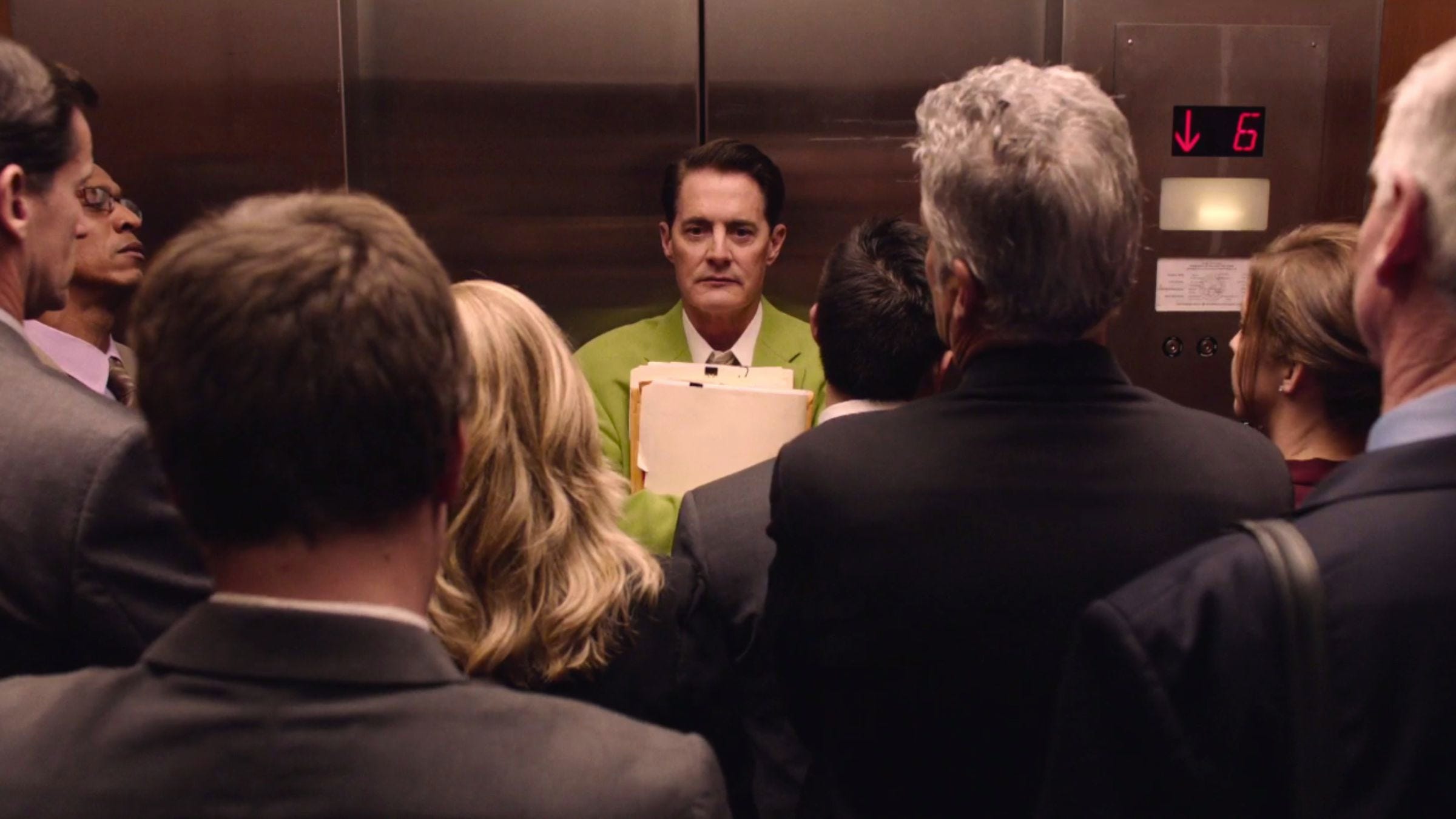
Colour can be used to draw the audiences eye to something in the frame by using contrasting, or complementary colours.
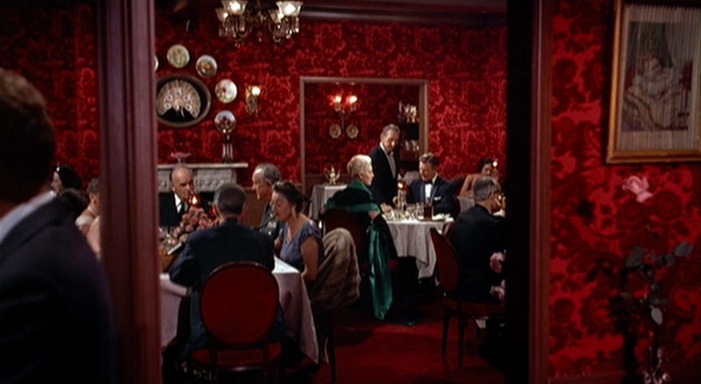
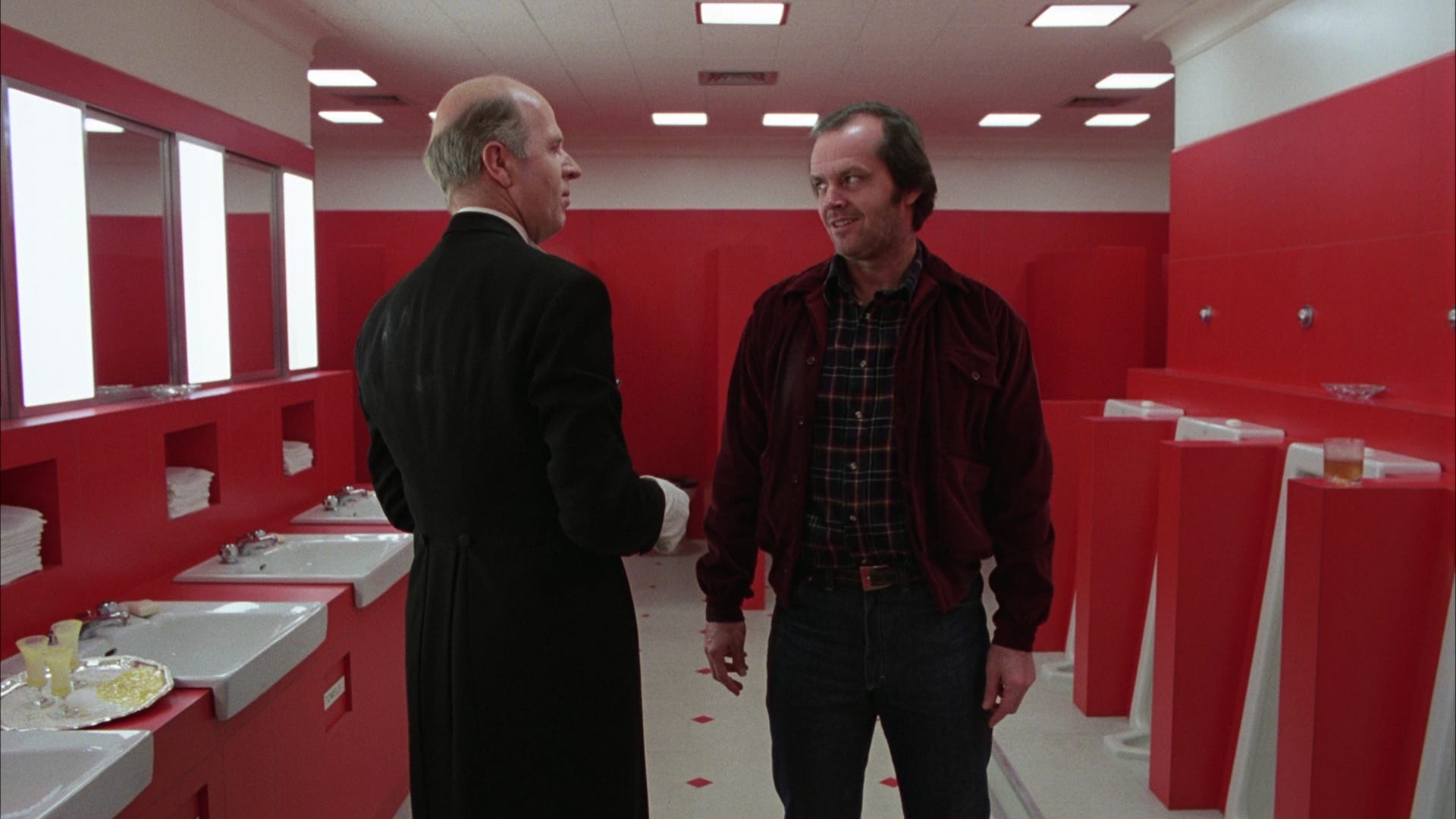
Media producers use colour to specifically connect connotations to specific scenes, characters or objects. Red, for instance, is typically seen as a colour of passion, danger, romance, or violence. Green is connected with nature or sickness, blue with calm or depression. Yellow is warm and inviting or a warning. Purple is seen to be connected with royalty or other-wordly.