Tableplop's main mission is to make your virtual table easy to use and one of the main ways it does that is with clear, easy to understand design. Over the past few months I’ve been hard at work redesigning the look and feel of tableplop to remove rough edges and improve ease of use. The changes are sweeping and nearly every page is updated along with the logo and the color themes!
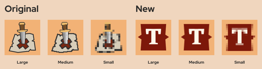
I love Tableplop’s original logo, it’s the classic location marker pin in a fantasy style I made around the start of development. The problem with it is that it is rarely ever seen at a size large enough to decipher. In a tab at 16x16px you can hardly tell what you’re looking at.
The new logo is easy to pick out at any size and combines a text highlight shape that appears throughout the new design. Featuring the letter “T” also makes it easier to remember what the logo is for without a title beside it.
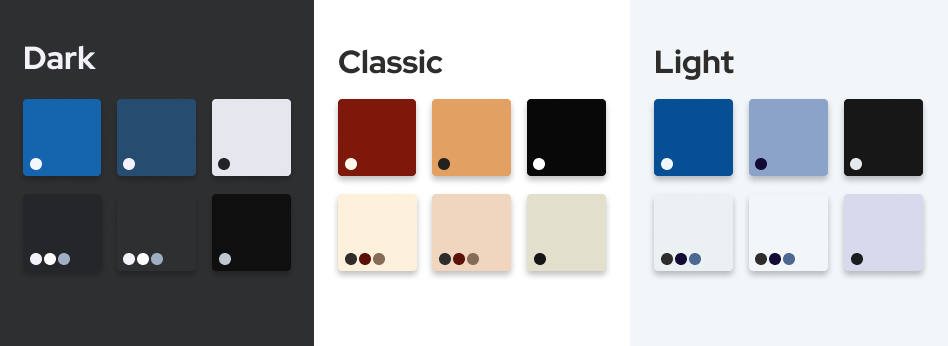
In addition to the dark and classic themes I've now added Light Theme: a light background color scheme f̶o̶r̶ b̶u̶r̶n̶i̶n̶g̶ y̶o̶u̶r̶ r̶e̶t̶i̶n̶a̶s̶ with better contrast than the others and more usable in bright environments. Themes in general are better supported now so that foregrounds match the theme fixing bugs where the background changed but the text or icon color stayed light making it unreadable. Ans because I think it looks really good, new users will now see the Classic Theme by ****default. Change your theme on your profile page.
The campaign pages have gotten the lion's share of changes, they are practically re-written.
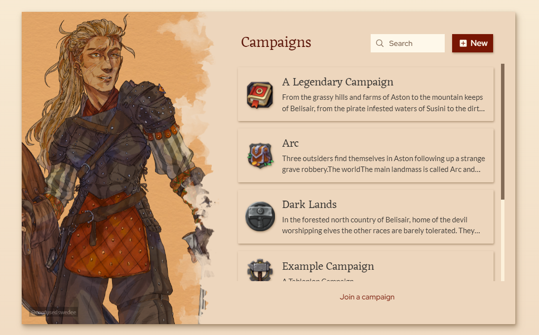
The campaign list, simple as it is now supports search for those of you with enough campaigns that that's helpful and features stunning character art by Mirjam Hildahl. Art like this makes an appearance in other parts of Tableplop as well livening up otherwise dull forms and panels.
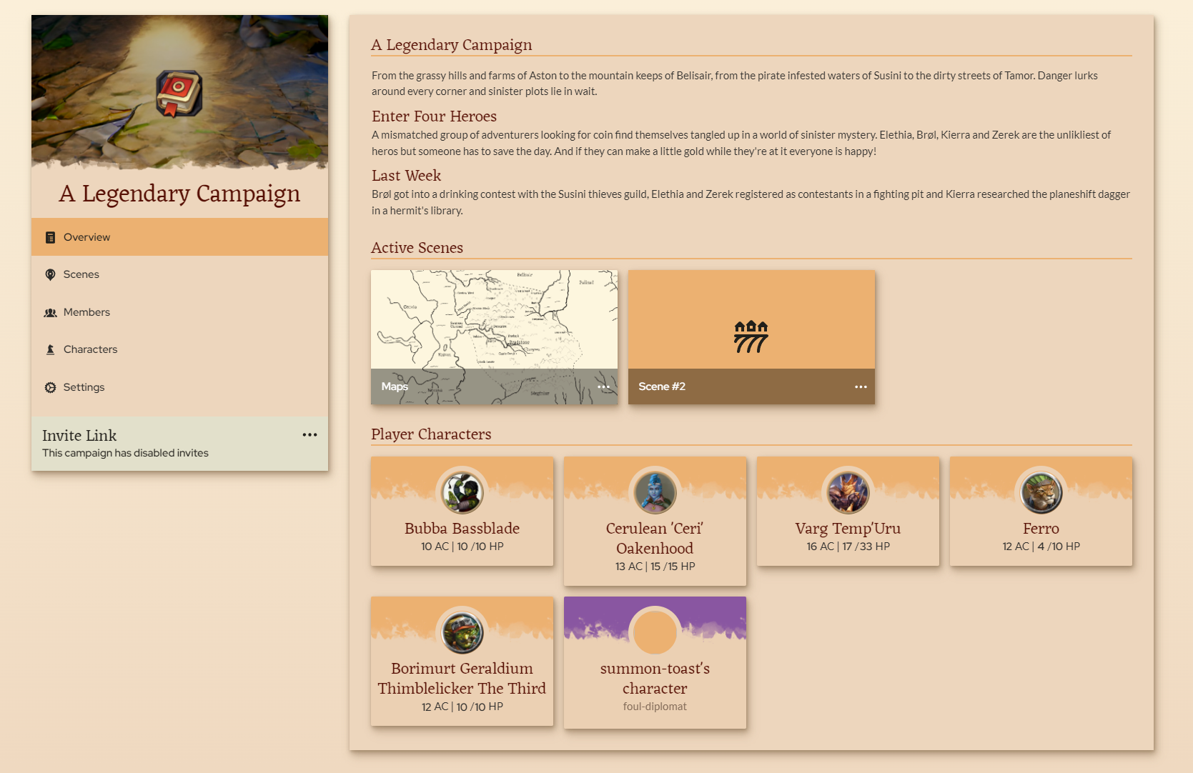
The campaign page was getting hard to navigate, with scenes on top and then the tabs for members, characters and settings. Each section was fighting for space on the same page. Each section is now split into its own page with an entry in the side bar. The overview page highlights the active scenes, player characters and campaign description so players can quickly see the important stuff right away. A few improvements to the subpages also found their way in like multi-select with shift and search for scenes.
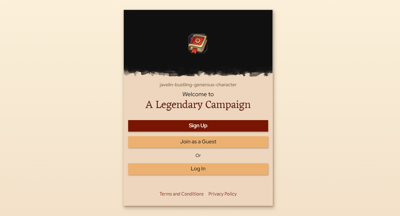
The campaign invite page, the first page players will often see of Tableplop is revamped visually and now includes the option to register, log in or to continue as a guest in which case they'll get a randomized username and a temporary account to join with.